Sunday, May 26, 2013

Pizzeria Must be Authentic


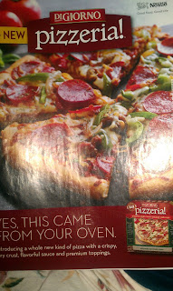
I found this ad in a People magazine. The first thing that caught my eye was the pizza itself, which I thought was the point. The large picture is an appeal the the need for physiological needs. I know the glare gets in the way, but that is a fine looking pizza. 

Immediately under the picture is a block of text, which assures the customer that they can get this in their own home. In a way, the text also uses "avante garde," because it's the newest thing in the frozen pizza department. The ad points out that it's new in two places, so DiGiorno really wants the customer to remember that this is a new product, and it's a "whole new kind of pizza." Now, I've had pizza with a crispy crust, flavorful sauce, and premium toppings, so I don't quite understand how it's different from all other pizzas. However, it says it's new, so I have to believe it, right? But these "new" features are also a use of "magic ingredients," because that's what makes it special. 

Overall, it's a pretty simple ad, but there are subtle details. They included a picture of the box so that when you're shopping late at night, you see the ad and thing, "Hey, that's a new kind of pizza! It has flavorful sauce!" and then you buy it and DiGiorno makes money. I also noticed that they made the color scheme look like pizza. The red that the text is on and the red logo is reminiscent of a pizza. It's all connected. Genius. I also thought it was interesting that the biggest text on the ad is "pizzeria!" with an exclamation point and no capitalization. Maybe they want you to think that buying this pizza will turn your house into a pizzeria, which would be a use of "transfer/association," or if they wanted to make the pizza seem more authentic, but they want you to pay attention to that word. There's also the light-colored Nestle logo in the corner. I thought they might have included that because Nestle is a generally credible company, but I'm not sure. Overall, I thought it was pleasing to look at, and I believe that's what DiGiorno was going for. 

Honda CRV Can Take You There


I saw this commercial in my eleventh hour of Hulu surfing. I thought it was kind of cute the first time, but after the third time, it got pretty annoying. Since I'm feeling optimistic, I'll discuss the things I liked about it first. It features a cute, wholesome girl fulfilling her dreams of travelling to all fifty states in United States. The entire commercial is shot in a soft light and features still photos, as if the audience is looking through a scrapbook that the girl has put together after her trip. I feel as though this could appeal to the need for affiliation, which is furthered by some of the pictures containing other cute people, or the original girl being driven around by her (most likely) friends. Because most of the pictures are taken by a third party, it also implies that there are people who are enjoying the trip with her. 

Another major appeal in the commercial is to the need to escape. Some very iconic tourist destinations are shot, like the Golden Gate Bridge or the Mount Rushmore sign in South Dakota. She's always on a beach or in front of a cozy house, and those images are highly appealing to a driver who feels like getting away. She is always in a shirt from her newest destination, which I thought was a cute idea. An ad technique that is manifests itself in this is "transfer/association." The ad wants the viewer to believe that if you buy this car, you can have never-ending adventures, or that if you buy this car, your "leap list" dreams can be fulfilled. But on that note, why is it a leap list? Is there some sort of patent on the term bucket list? Oh! The commercial also uses "plain folks," because she isn't in fancy clothes or eating in fancy restaurants. Because of this technique and the casting, I would place the car's target audience at youthful, middle class adults who aren't looking for  a luxury vehicle. 

Because there is no voice over or text for the most part, one of the most important things is the music. And they were not subtle in their music choice. Throughout the whole song, it's a cute little tune that's upbeat and happy, just like the girl. And it features whistling, which I thought was meant to make it seem more grassroots or down to earth. The music isn't pretentious, so you could have this soundtrack too. My problem with the little diddy is when "live it up" is added as lyrics. All subtly is thrown out the window, because it's blatantly trying to connect memorable experiences to the car. And I'm just not buying it. I thought the concept started as a good idea, but it just didn't work in the end.  

Sunday, May 19, 2013

Samsung Galaxy s4 is Intense


And I'm not talking about a circus fire. I feel that there are two very prominent aspects of the ad that are the main focuses, one being the music, and another being the camera editing. The music builds in a classical crescendo, considering it is Vivaldi's Four Seasons, but it drops off when the text first appears on screen. I believe the advertisement does this to appeal to the need to satisfy curiosity. You want to look to the screen to find out why the music suddenly cut off, and when your attention is drawn to the screen, the camera cuts from shot to shot quickly in order to keep it. The Gestalt principle is an important part of the camera editing. Along with the intense music, the ad features unusual camera movements and lens exaggerations, which encourages the viewers to look closely at the ad. 

 Features of the phone are displayed in the ad, like the ability to sense when the user is close (or whatever the technical name for that is) and the feature of the camera that lets you take pictures what is happening on both sides of the camera. I believe the ad uses this as a visual form of "facts and figures." The visuals are still used to prove the superiority of the product. Semi-facts and figures are used in the text between camera shots, as they advertise aspects such as clarity of the screen and a slimmer design. 

The ad also appeals to the need to aesthetic sensations. The video is shot in such a way that the phone looks very shiny and beautiful. There are a lot of shots that spans the phone, focuses on shiny parts that make it look classy as can be. There are also the camera shots that don't include the phone, like water dripping and bubbles forming, which also appeal to the same need.

Overall, the ad was too intense for my liking. I felt like it was a little silly to have choral chanting in the background of a phone commercial, and I'm sure that's not what Vivaldi intended his work to be used for. I also don't understand what makes the phone a "life companion," something the ad claims at the very end without making any explanation. However, the visuals were very pleasing and some of the features were intriguing  so I didn't think it was a terrible commercial. 


Ben and Jerry's Can Rewrite History


I saw this ad in a Bon Appetit magazine. The ad caught my attention because the main visual spread stands out so much against the plain white background. It appeals to the need to satisfy curiosity because of all the little details in the advertisement. Not only does it stand out and feature a strange concept, but the closer you look, the more you find. At first glance, I missed the little men pushing the bowls of yogurt into the Trojan Cow, and I didn't notice all the little details that are included inside the cup of Ben and Jerry's. I appreciate the ad based on those aspects alone.

The ad isn't just about the picture, however. On the bottom is a short paragraph that uses the ad technique of "wit and humor." It plays out a situation where instead of a Trojan Horse filled with soldiers, the Greeks gift the city of Troy a cow that is filled with delicious Greek yogurt. It's a silly idea, and the text features a lighthearted tone that I cannot replicate, which is why I don't work for Ben and Jerry's marketing team. 

Another aspect of the wit and humor technique is the last part of the ad. "It's really Greekin' good" stands out on the white background and is a play on words, which is just so funny. Next to the text are pictures of the actual product, which is the new frozen yogurt. This appeals to physiological needs. I know that Ben and Jerry's doesn't stick out of the container in such a perfect sphere shape, but it looks good enough that I want to believe.  

I liked this ad because I thought it was cute. The use of glittering generalities implies that this frozen yogurt is good enough to stop a war, which is a silly idea, and I am tempted to buy it just to see. I appreciate the work that appears to have been put into the visuals of the ad, and the wooden cow is cute. That's what I look for in a frozen yogurt ads. 

Sunday, May 12, 2013

Bon Appegeico


(Sorry about the picture being sideways. It's simply trying to mimic my life and I can't change it. Oops!)

I found this ad while skimming through a Bon Appetit issue. The first thing that grabbed my attention was the bright orange background color. The white bubble also stands out quite a bit against its contrasting background. In the actual magazine, the background is more orange than red, and since it was next to a picture of a bunch of green asparagus, the ad was very striking. And in the corner is a bright green gecko, which is, of course, Geico's well-known mascot. 

The majority of the ad is taken up by the white speech bubble-looking design that features a hilarious joke. This is an obvious use of the common advertising technique "wit and humor." The use of "your" also attempts to make a personal connection with the reader, possibly in hopes to convince the customer that the service is personal, just like the advertisement. It also features the technique of "simple solutions." The second line of text reads, "See how easy it is to save money." It's as easy as making a lame joke, I guess. Because the quote is black and white, it must be simple. Or that's what the advertisers want you to believe. 

I believe the ad appeals to the need to satisfy curiosity. Because the question on a white background stands out so much and is not what you expect from an insurance ad, it certainly makes one stop and ask, "What?" And the punchline of the joke does the same thing, considering I have no idea what arrabbiata sauce is. The joke makes the reader pay more attention to the ad, even if the rest doesn't exactly answer the questions I have. 

I think the ad is effective because it's simple. I feel as if there isn't much to analyze because there just isn't much in the ad. It's quick,simple, and it goes down easy. The gecko and the white logo makes it easy to identify what product is being sold, and it gives a phone number, so it's easy to contact the company. But despite these pros, there is one major con that bothers me. It gives no information on how Geico can save you money or what makes it easy to save money. But as far as advertisements go, it was cute and managed to stand out without being obnoxious, so I appreciate it. 

Saturday, May 11, 2013

Beach, Books, and Profit


I found this ad in a recent National Geographic issue. Since I've started dreaming of summer vacation, the first thing that caught my attention was the ocean scene in the background. I don't have much of an interest in buying a Kindle, but the advertisement definitely drew me in, because it looks amazing. It appealed to my need to escape and my need for aesthetic sensations. The Kindle Paperwhite doesn't really have anything to do with a serene ocean, but having it in the ad makes it very appealing. The top of the ad reads "Perfect for Paradise," so obviously if you buy this Kindle, your trips to paradise will be even better. And if you don't have a trip to paradise planned, then this Kindle will help get you there. Where can I order one? And "Perfect for Paradise" starts a trend of 'P's in the ad, and I always appreciate alliteration. 

As I just mentioned, the background to this ad is pretty important. But also important are the colors. The white of the Kindle really stands out against the blue sky and the blackish rock formation, which is important because it's called Kindle Paperwhite. Smart move, advertisers! That's cool! 

I believe another important part of the advertisement is the technique of facts and figures. At the bottom of the ad are three features of the Kindle, which attempts to prove that this e-reader is superior to books and the rest of the e-readers on the market. You can take 1,100 books to your perfect vacation, something you could not be able to do otherwise. I have no idea why someone would need that many books at once, but now they can have them! And it can read in bright sunlight, which is apparently something unique to the Kindle Paperwhite. The ad doesn't tell how it allows you to read in sunlight, but advertisements are always truthful, so you just have to accept it. 

The one thing that mystifies me about the ad is how random the Kindle placement is. It's just a hand floating in the ocean. Where's the rest of the person? Is said person standing in the water? Is the whole beach scene a figment of the person's imagination? I think the placement is so random because of the need for aesthetic sensations. The ocean doesn't have anything to do with the Kindle, but that's okay, because it draws attention to the advertisement.

Overall, I thought this ad was effective. It is nice to look at, it gives features of the device, and it's simple. It manages to be distracting without being loud and annoying, so I think the marketing team did their job of cutting through the clutter. 


Sunday, May 5, 2013

Jack in the Box Raises My Blood Pressure for the Wrong Reasons


I had to talk about this commercial because I hate it so much. I'm almost driven to tears of anger every time it comes up on Hulu because it is so unbelievably stupid. Not a lot of things offend me, but this commercial does. I feel like there are a lot of stereotypes about young people and how ridiculous the newer generations have become because of social media, and I feel this ad back such claims up. It features a clueless young woman who is constantly distracted by social media and who can barely function in the workplace. The tanning bed comment at the end is the one of the dumbest things I've heard, and I certainly does not appeal to my sense of humor. 

I'm sure that the marketing team at The Box knew that the commercial would annoy some people, and I'm sure they were fine with that. As we have discussed in class, marketing teams are willing to do anything to stand out in the crowd of advertisement, and this ad does that. It stands out to me, at least, because it's so darn infuriating. If nothing else, the commercial did a very fine job of attracting my very negative attention.

One of the things that stood out the most to me was the diction created for the ad. Words such as "chipoltcray" and "crazeamaze" will forever be burned into my memory. I hate them, but I'll remember them. The time the intern spent talking about the burger's components is the real substance behind the commercial  because it's the only part that focuses on the actual product being sold. The ad features very quick camera editing and very fast talking, so it kept my attention by jumping from one thing to another.

The advertisement employs the "Wit and Humor" technique. It attempts to, at least. I believe that by making everything happen in such quick succession, the commercial attempts to throw a lot of stuff at the audience and hope that something makes them laugh. I believe the main appeal used in the commercial is physiological need, because the sandwich looks pretty appealing. The cheese is perfectly melted, the bacon is totally uniform, and the tomatoes have a sprinkling of water on them, which means they have to be fresh. Now, I highly doubt that an actual chipotle chicken club combo would look anything like that, but the commercial makes it look pretty darn good. 

Overall, I thought the commercial was incredibly annoying, but it affected me enough to watch it roughly ten thousand times in order to analyze it, and that's more than I can say about all the other commercials I watch. Sure, the ad makes the sandwich look appealing, but it's covered in so many layers of annoying stereotypes that I would never step foot into a Jack in the Box unless my life depended on it. The actress did a fine job of portraying the role, though. 


Oil Help You Out

I found this ad in the back of an old National Geographic magazine. The first thing that caught my attention was the coloring, especially considering it was next to a black and white spread. The blue was very striking, and the layers of...something...caught my attention as well. And, of course, in the center of the ad was a woman in a bright yellow sweater that quietly proclaimed, "Look at me!" I think the woman's sweater served as more than an attention-grabbing piece of clothing. Yellow is usually associated with some form of happiness, and between the sweater and the little sun at the top of the tank, it gives the impression that the whole situation is a happy and helpful one. I don't exactly know what's happening with the tank, but it seems like a good exercise in science. 

The next thing I noticed were the little details included. However, these details confused me rather than clarified what was happening. In the top of the tank there's an oil tanker, and since the ad is about an oil company, that makes sense. Flying around the boat is a helicopter. What. Just...why? Tell me, oil ad! Tell me! And the man to the left on a step ladder is pouring in...something. Fish food for the little shark that is also in the tank? WHY? Well, actually, I assume it's to show how much the oil company cares about preserving the environment. Not only can the ecosystem thrive while the company is drilling, but they'll take special care to ensure that. Or maybe that man just is just confused about his job.  

Speaking of the man and the woman in the sweater, I believe the ad uses the "Plain Folks" technique. These scientists aren't wearing lab coats, they're dressed like normal people. They're normal people who just want to keep the environment safe while doing their jobs. Nothing about this ad even whispers "I'm better than you." The man on the step ladder is bald! If that isn't trying to connect to the common man, I don't know what is. And the ad isn't set in a fancy laboratory - it looks like it could just be a warehouse. Besides from the tiny flying helicopter and the tiny shark, there's nothing extraordinary about the scene being set. 

The ad appeals to one's need to satisfy curiosity. Because there's so much happening in such a small space, you almost can't look away from it. And the more you look, the more you find. And immediately under the eye-catching photo is text about the company's mission. The bottom of the ad was cut off in my picture, but it has the logo, which is a pink design with the name Statoil next to it. Their little motto is included also, which is "Always exploring, never satisfied." Because of the text, I believe the ad also appeals to one's need to feel safe. It says that the company is focused on keeping people and the environment safe, so there you go. 

Overall, I feel the ad was sort of effective. It was attention-grabbing and very detailed, but it didn't necessarily get me to believe that the oil company was focused on the safety of the environment during drilling expeditions. Even the bald man couldn't convince me of that.